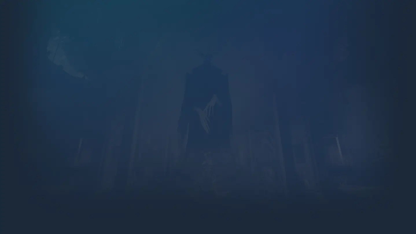
Exploring the Mesmerizing Deadlock Art: A Visual Deep Dive
Discover why Deadlock art is setting new industry standards. Dive into our detailed analysis of character design, environment cohesion, and visual storytelling.
Published: Deadlock Wiki Editorial Team
Table of Contents
The visual identity of Valve's latest title has become a focal point of discussion among enthusiasts, and for good reason. Understanding the intricacies of Deadlock art is essential for anyone who appreciates the marriage of occult themes and industrial design in a modern gaming landscape. This guide explores why this aesthetic direction is not just a style choice, but a fundamental pillar of the gameplay experience.
From the expressive faces of characters like Ivy to the moody, meticulously crafted environments, the Deadlock art style represents a significant evolution in Valve’s design philosophy. By examining these elements, players can gain a deeper appreciation for the "primordial ooze" of world-building that makes this game feel uniquely cohesive and alive.
The Philosophy of "Magic-Infused" World Building
One of the most compelling aspects of the game’s presentation is its refusal to simply "throw magic" into a standard setting. Instead, the design team at Valve has created a world where the occult is baked into the very foundation of existence. This approach ensures that the environment feels like a fundamental modification of reality rather than an overlay.
Comparative Design Principles
Element
Traditional Fantasy Approach
Deadlock Art Approach
World Logic
Magic added to modern settings
Magic fundamentally alters reality
Character Motif
Generic class archetypes
Story-driven visual language
Environment
Static, decorative assets
Narrative-rich, interactive scenes
According to community observations, this creates a "golden age, rose-tinted" version of New York that feels grounded yet supernatural. When you explore the map, you aren't just seeing buildings; you are seeing a society defined by a magical industrial revolution.
Analyzing Character Visual Identity
Character design in this game is a study in "harmony." Each hero is defined by a central thematic motif that dictates everything from their silhouette to their weapon animations. This isn't just aesthetic; it serves as a visual tutorial, helping players instantly recognize heroes and their potential intent.
Tip
Understanding Character Readability
Valve uses desaturated colors in movement-heavy areas to ensure that focal points—like a character's face or weapon—stand out immediately during intense firefights.
Notable Character Design Elements
Mina: Centralized around bat iconography and vampire noble aesthetics; her weapon functions as a thematic extension of her lore.
The Doorman: Utilizes a "keyhole" motif, with blue emissives acting as a narrative marker for his hidden, unfathomable power.
Seven: A fusion of prisoner garb and electrical apparatus, creating an undying revenant aesthetic that emphasizes his lore as a survivor of capital punishment.
Environment Design: The Macro and Micro Balance
The environment is the "meat and potatoes" of the game’s visual success. By balancing micro-level texture details—like layers of grime and grunge—with macro-level set pieces, the artists create compositions that feel like paintings rather than mere digital arenas.
Texture Design Logic
Community reports highlight that the team follows a specific balance to prevent visual noise:
Base Layer: Plain, desaturated colors.
Detail Layer: Subtle visual interest via layers of dirt and grime using rectangular brushes.
Hero Layer: Sparingly used vibrant colors or emissives to guide the player's eye toward critical pathing or objective markers.
This modular approach, as noted by creative enthusiasts, allows for a "Lego-like" construction of levels that still maintain a handcrafted feel. You can see this in areas like the Green Lanes Church, where nature and architecture blend to provide both aesthetic beauty and functional map call-outs.
Technical Artistry: Emissives and Lighting
If you want to understand what makes the Deadlock art stand out, you must pay attention to the lighting. The use of emissives—the glowy parts on meshes—is handled with exceptional restraint. Whether it's the lanterns in a subway tunnel or the glowing sigils in a secret shop, these lights don't just decorate; they communicate.
Why Emissives Matter
High-quality emissive usage serves two purposes: guiding the player’s attention toward gameplay-relevant zones and reinforcing the supernatural identity of the items or characters they adorn.
For players interested in the technical side, the game utilizes a sophisticated mix of non-metallic metal rendering techniques. This allows for surfaces that look convincingly metallic under static lighting conditions, perfectly complementing the stylized, painted art direction.
Community Resources and Tools
For those looking to create their own assets or delve deeper into the game’s aesthetic, there is a thriving ecosystem of community-made tools. The Deadlock Graphical Library is an essential resource for fans and content creators.
Useful Community Resources
Logos & Typography: High-resolution recreations of in-game fonts and logos.
Item Card Templates: Complex PSD systems that allow for consistent, high-fidelity card creation.
Minimap Assets: Layered files that help players map out strategies while mirroring the official aesthetic.
FAQ: Frequently Asked Questions
Q: Why does some Deadlock art look different from the final game?
A: Because the game is in active development, some assets are placeholders. The design team is constantly updating models and textures to match the finalized artistic baseline of newer characters.
Q: How does Deadlock art improve gameplay?
A: Through "visual readability." By using color gradients and distinct shape languages, the artists ensure that players can identify threats and objectives at a glance without being overwhelmed by visual clutter.
Q: Where can I find high-quality assets for fan projects?
A: Check the official forums or community-maintained repositories like the Deadlock Graphical Library for fonts, logos, and UI templates created by fellow fans.
Q: Is the art style inspired by Team Fortress 2?
A: Yes, many observers note a shared heritage in silhouette-based character design and the use of bold, blocky shapes, though this game pushes those concepts into a more modern, occult-themed direction.